Khisto — optimal binning histograms
Khisto uses the Khiops optimal binning algorithm to choose both the number and width of bins. This notebook introduces its plotting API with quick examples.
New to variable-width histograms? Read the counts vs density tutorial to learn how to interpret them.
1. Quick start
[1]:
import numpy as np
import matplotlib.pyplot as plt
import khisto

SEED = 42
A standard Gaussian — linear scale
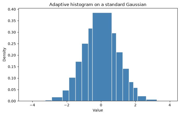
For a bell curve, a linear axis is the natural view. khisto.matplotlib.hist works like plt.hist, but the bins adapt to the data.
[2]:
gaussian = np.random.default_rng(SEED).normal(0, 1, 10000)

fig, ax = plt.subplots(figsize=(7, 4.5))
khisto.hist(gaussian, ax=ax, color="steelblue", edgecolor="white")
ax.set_title("Adaptive histogram on a standard Gaussian")
ax.set_xlabel("Value")
ax.set_ylabel("Density")
plt.tight_layout()
plt.show()
A heavy-tailed Pareto — log-log scale
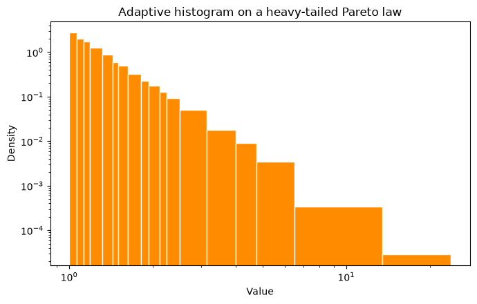
Heavy-tailed data spans several orders of magnitude, so a log-log view is the natural one. Fixed-width bins struggle here — they are either too coarse in the body or empty in the tail — while adaptive bins stay informative all the way out.
[3]:
pareto = np.random.default_rng(SEED).pareto(3, 10000) + 1.0  # shift to start at 1 for log axes

fig, ax = plt.subplots(figsize=(7, 4.5))
khisto.hist(pareto, ax=ax, color="darkorange", edgecolor="white")
ax.set_xscale("log")
ax.set_yscale("log")
ax.set_title("Adaptive histogram on a heavy-tailed Pareto law")
ax.set_xlabel("Value")
ax.set_ylabel("Density")
plt.tight_layout()
plt.show()
2. A richer example — a three-component mixture
To exercise the rest of the API we use a more realistic distribution that mixes three components:
a standard Gaussian (broad central mass),
a narrow, peaked Gaussian (a sharp mode), and
a lognormal (a stretched right tail).
10,000 samples keep the adaptive refinement visible while staying fast to compute. This single data array is reused for every example below.
[4]:
rng = np.random.default_rng(SEED)
data = np.concatenate([
    rng.normal(0, 1, 5000),       # standard Gaussian
    rng.normal(3, 0.25, 2000),    # narrow, peaked Gaussian
    rng.lognormal(mean=0, sigma=1, size=3000),  # lognormal right tail
])

print(f"Samples: {data.shape[0]}")
print(f"Range: [{data.min():.2f}, {data.max():.2f}]")
print("Shape: a broad bell, a sharp spike near 3, and a long lognormal tail.")
Samples: 10000
Range: [-3.65, 56.03]
Shape: a broad bell, a sharp spike near 3, and a long lognormal tail.
Adaptive vs fixed-width bins — linear scale
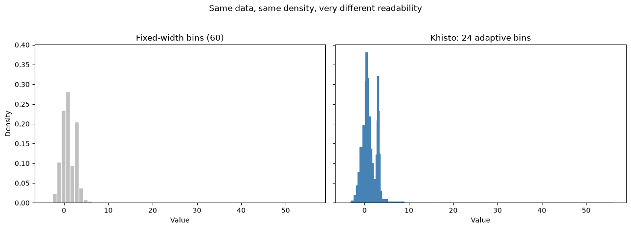
The same data, the same density normalization, the same axes — only the binning differs. Fixed-width bins blur the sharp mode and waste resolution on the empty tail; Khisto’s adaptive bins keep both readable.
[5]:
fig, (matplotlib_ax, khisto_ax) = plt.subplots(1, 2, figsize=(13, 4.5), sharey=True)

# Matplotlib / NumPy: fixed-width bins (density)
matplotlib_ax.hist(data, bins=60, density=True, color="silver", edgecolor="white")
matplotlib_ax.set_title("Fixed-width bins (60)")
matplotlib_ax.set_xlabel("Value")
matplotlib_ax.set_ylabel("Density")

# Khisto: adaptive bins (density by default)
khisto_density, _, _ = khisto.hist(data, ax=khisto_ax, color="steelblue")
khisto_ax.set_title(f"Khisto: {len(khisto_density)} adaptive bins")
khisto_ax.set_xlabel("Value")

fig.suptitle("Same data, same density, very different readability", y=1.03)
plt.tight_layout()
plt.show()
The same comparison — log-log scale
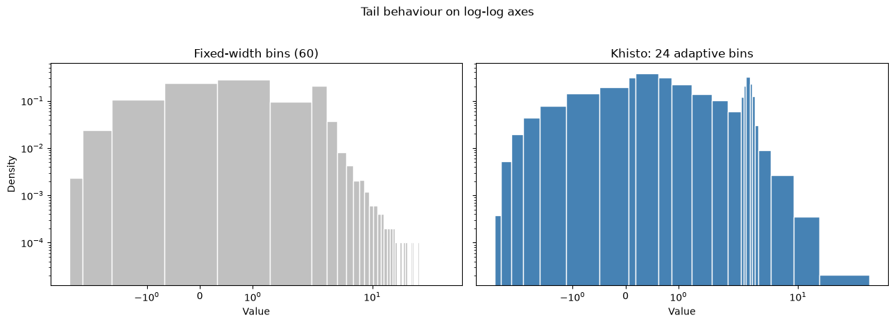
On log-log axes the tail behaviour comes to the foreground. Empty fixed-width bins simply vanish (a zero has no place on a log axis), whereas adaptive bins widen to keep the tail populated and visible.
[6]:
fig, (matplotlib_ax, khisto_ax) = plt.subplots(
    1, 2, figsize=(13, 4.5), sharex=True, sharey=True
)

matplotlib_ax.hist(data, bins=60, density=True, color="silver", edgecolor="white")
matplotlib_ax.set_title("Fixed-width bins (60)")
matplotlib_ax.set_xlabel("Value")
matplotlib_ax.set_ylabel("Density")
matplotlib_ax.set_xscale("symlog")
matplotlib_ax.set_yscale("log")

khisto_density, _, _ = khisto.hist(data, ax=khisto_ax, color="steelblue", edgecolor="white")
khisto_ax.set_title(f"Khisto: {len(khisto_density)} adaptive bins")
khisto_ax.set_xlabel("Value")
khisto_ax.set_xscale("symlog")
khisto_ax.set_yscale("log")

fig.suptitle("Tail behaviour on log-log axes", y=1.03)
plt.tight_layout()
plt.show()
3. NumPy-like API: khisto.histogram
khisto.histogram is a drop-in replacement for numpy.histogram: same return value (hist, bin_edges), but the bins adapt to the data instead of being fixed-width.
[7]:
hist_counts, bin_edges = khisto.histogram(data, density=False)

print(f"Number of bins: {len(hist_counts)}")
print(f"Bin edges: {bin_edges}")
print(f"Frequencies: {hist_counts}")
Number of bins: 24
Bin edges: [-3.6484375 -3.125     -2.4375    -1.9375    -1.625     -1.125
 -0.5        0.0625     0.1875     0.625      0.875      1.25
  1.625      1.9375     2.5        2.6875     2.8125     3.125
  3.3125     3.5        3.8125     5.1875     8.9375    16.875
 56.03125  ]
Frequencies: [   2.   36.   99.  137.  386.  890. 1101.  386. 1668.  788.  818.  515.
  316.  340.  228.  261. 1006.  435.  234.   94.  124.  100.   28.    8.]
[8]:
# With density normalization the integral over the range is ~1
density, bin_edges = khisto.histogram(data, density=True)

widths = np.diff(bin_edges)
integral = np.sum(density * widths)
print(f"Integral of density: {integral:.6f}")
Integral of density: 1.000000
[9]:
# Cap the number of bins
hist_limited, edges_limited = khisto.histogram(data, max_bins=5)
print(f"Limited to max 5 bins: got {len(hist_limited)} bins")
print(f"Bin edges: {edges_limited}")
Limited to max 5 bins: got 5 bins
Bin edges: [-3.6484375  0.         4.         8.        16.        56.03125  ]
4. Matplotlib API: khisto.matplotlib.hist
khisto.matplotlib.hist keeps the familiar matplotlib workflow. With variable-width bins, density is the view to reach for first.
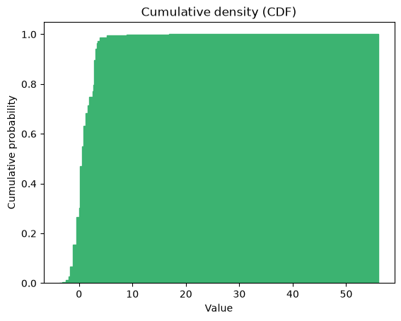
Cumulative plots
khisto.matplotlib.hist follows matplotlib’s cumulative semantics, including the cumulative density (CDF), raw cumulative counts, and reverse accumulation.
[14]:
# Cumulative density (CDF) first — the most interpretable cumulative view
cdf_n, cdf_bins, _ = khisto.hist(
    data, cumulative=True, color="mediumseagreen",
)
plt.title("Cumulative density (CDF)")
plt.xlabel("Value")
plt.ylabel("Cumulative probability")
[14]:
Text(0, 0.5, 'Cumulative probability')
5. Core API: compute_histograms and HistogramResult
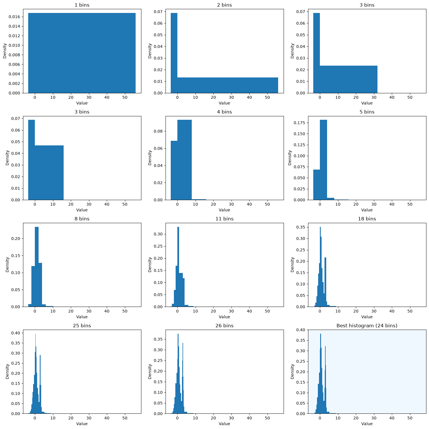
When a single histogram is not enough, the core API exposes the full sequence of granularities and tells you exactly where Khiops chooses to stop.
[11]:
results = khisto.core.compute_histograms(data)

print(f"Number of granularity levels: {len(results)}\n")
print("Granularity levels:")
for result in results:
    marker = " <- BEST" if result.is_best else ""
    print(f"  Granularity {result.granularity}: {len(result.frequencies)} bins{marker}")
Number of granularity levels: 12

Granularity levels:
  Granularity 0: 1 bins
  Granularity 1: 2 bins
  Granularity 2: 3 bins
  Granularity 3: 3 bins
  Granularity 4: 4 bins
  Granularity 5: 5 bins
  Granularity 6: 8 bins
  Granularity 7: 11 bins
  Granularity 8: 18 bins
  Granularity 9: 25 bins
  Granularity 10: 26 bins
  Granularity 11: 24 bins <- BEST
[12]:
# Visualize selected resolutions
fig, axes = plt.subplots(4, 3, figsize=(15, 15))
axes = axes.flatten()

for ax, result in zip(axes, results):
    ax.stairs(result.densities, result.bin_edges, fill=True)
    if result.is_best:
        ax.set_title(f"Best histogram ({len(result)} bins)")
        ax.set_facecolor("aliceblue")
    else:
        ax.set_title(f"{len(result)} bins")
    ax.set_xlabel("Value")
    ax.set_ylabel("Density")

plt.tight_layout()
plt.show()
Summary
Khisto gives you a better histogram without making you tune bins by hand:
khisto.histogram — a NumPy-like API with adaptive bins.
khisto.matplotlib.hist — readable density plots by default, with the usual matplotlib workflow.
khisto.core.compute_histograms — full control over the granularity series, with
HistogramResultexposing counts, probabilities and densities.
To go further, Histograms - Khiops builds the intuition from the simplest histogram to the most complex.